Chapter 11 Language of Descriptive Statistics
Section 11.2 Frequency Distributions and Percentage Calculation11.2.5 Types of Diagrams
Qualitative and quantitative discrete data gained from a sample are often presented graphically by bar charts.
Info 11.2.20
The bar chart shows the absolute or relative frequencies as a function of a finite number of property values in the sample. The bar lengths are proportional to the values they represent.
This is now illustrated by an example. The species of trees at the forest's edge was determined. The possible characteristic attributes are:
A sample resulted in the following original list:
This original list results in the following empirical frequency table:
| Attribute | absolute | relative | in |
| Oak | 50 | ||
| Beech | 20 | ||
| Spruce | 30 |
The bar chart corresponding to this empirical frequency table is shown in the figure below.
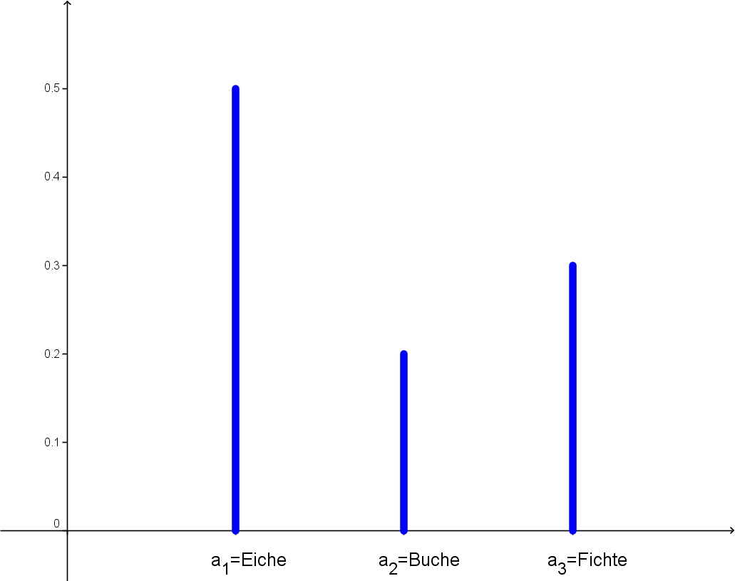
Bar chart
Qualitative properties are often represented by pie charts:
Info 11.2.21
A slice is assigned to each characteristic attribute according to its relative frequency, where
Here, is the angle (in degree measure) of the slice (circular sector) that corresponds to the attribute within the original list .
This is again illustrated by an example.
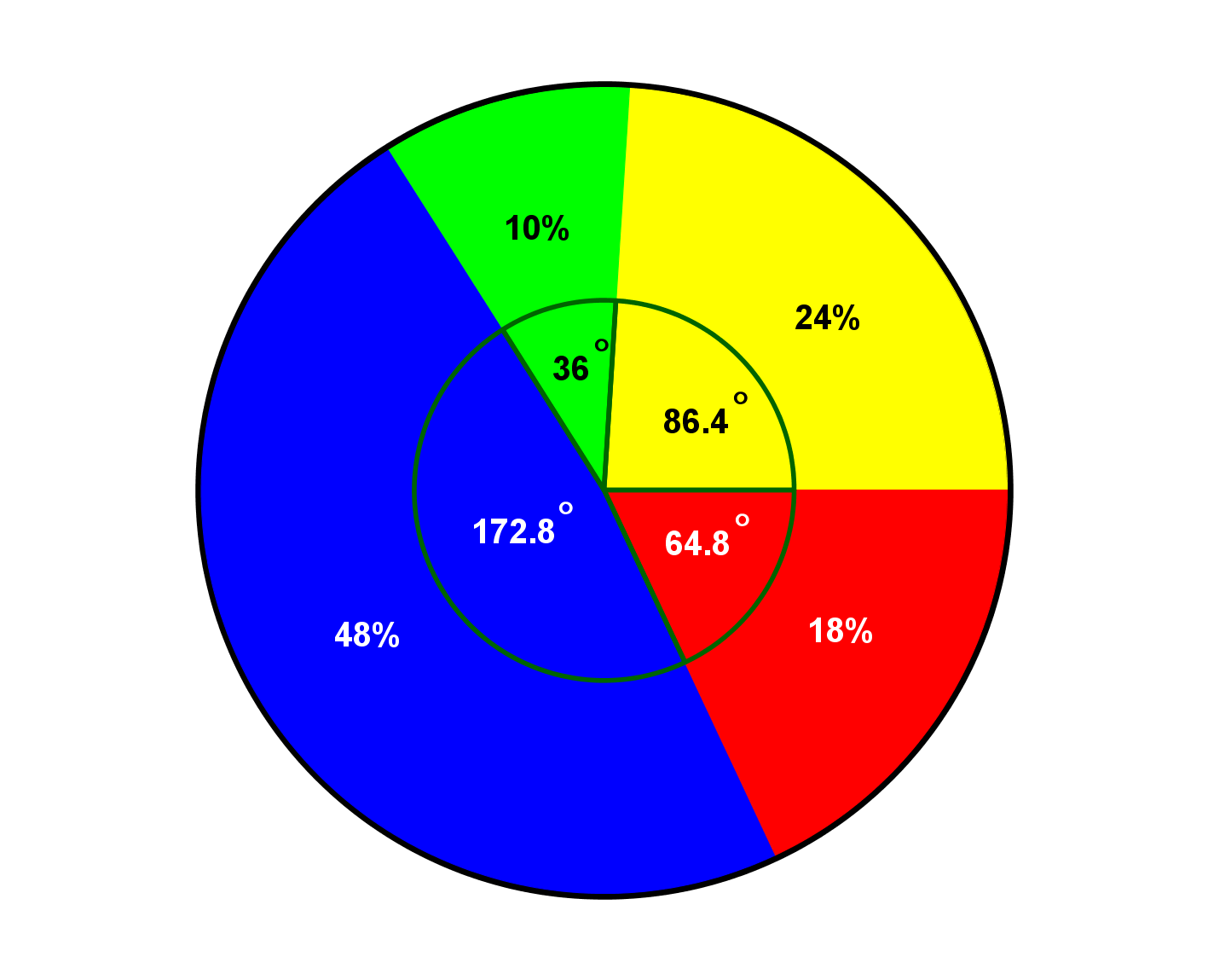
A number of households were queried as to how satisfied they were with a new kind of barbecue. The possible answers were: very satisfied (1), satisfied (2), less satisfied (3) and not satisfied (4).
The survey resulted in the following empirical frequency table.
| Attribute | Absolute frequencies | Relative frequencies | Percentage |
| Very satisfied | |||
| Satisfied | |||
| Less satisfied | |||
| Not satisfied | |||
| Sum |
The corresponding angles are, according to the Info Box above,
- ,
- ,
- ,
- .
This results in the following pie chart:
It is often pointless to present all possible attributes in a diagram. It is more convenient to classify them and draw only the frequencies of the classes into a diagram. This is the only way to visualise the frequencies of continuous characteristics in a bar or pie chart.
Let be a quantitative (continuous) property, and the original list for a sample of size . An empirical frequency distribution is obtained according to the following approach:
- Find the minimum and the maximum sample value, i.e.
- List these and all values in between, rounded to the required fractional digit and sorted by size. This converts the (continuous) property into a discrete property.
- Prepare a tally sheet and draw the corresponding empirical frequency distribution.
The empirical frequency distribution of a continuous property can be very broad. In particular zeros may appear, caused by measurement values that do not occur in the original list (sample). Due to this, the empirical frequency table gets very confusing and bulky. Hence, a classification is carried out to reduce the amount of data (data reduction). In fact, this corresponds to a reduction of measurement accuracy (rounding!).
There is no general rule defining the number of classes or the size of a class. However, the following guidelines are recommended:
- Uniform classification: Find and . Then divide the interval with small into uniform, non-overlapping, half-open subintervals.
- Avoid classes that are too small or too large.
- If possible, avoid classes with only a few observations.
- Find approximately equally sized classes, where is the number of samples.
A histogram is obtained through the following approach: let
be an original list for a sample of size of a quantitative property .
- Use a classification into classes. Let the interval of the th class be .
- Let be the number of sample values in the interval for . The numbers are also called absolute class frequencies.
- For each draw a rectangle over the base of height with the area . The areas are the relative frequencies.
The total area of these rectangles equals .
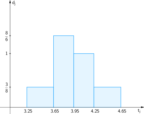
This approach is now illustrated by a detailed example. In a data centre, the processing time (in s, rounded to one fractional digit) of program jobs was determined. This resulted in the following original list of a sample of size :
| 3.9 | 3.3 | 4.6 | 4.0 | 3.8 |
| 3.8 | 3.6 | 4.6 | 4.0 | 3.9 |
| 3.9 | 3.9 | 4.1 | 3.7 | 3.6 |
| 4.6 | 4.0 | 4.0 | 3.8 | 4.1 |
The smallest value is s, the largest value is s, the increment is s. According to the guidelines above, we should find approximately equally sized classes. Here, we use the following classification into classes.
| Class | Data | |
| Class 1 | "From to " | |
| Class 2 | "From to " | |
| Class 3 | "From to " | |
| Class 4 | "From to " |
The table of the absolute and relative frequencies has the following form:
| Class | abs. Class frequency | rel. Class frequency |
| Class 1 | ||
| Class 2 | ||
| Class 3 | ||
| Class 4 |
The heights of the rectangles are as follows:
- Class 1: , i.e. .
- Class 2: , i.e. .
- Class 3: , i.e. .
- Class 4: , i.e. .
Thus, we have the following histogram: